
Logos are like the face of your brand and it acts as the first impression on your customer. It leaves an image of your brand and a lot of times your brand is just recognised through their logos and not the brand’s name.
However, last year it was seen that some worldwide known brands changed their logos making a more significant impact on their brand. Let’s look at some of the top-notch brands that redesigned their logos in 2021.
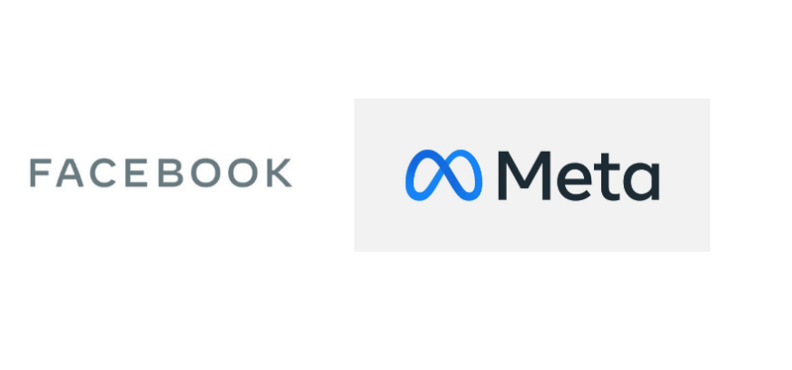
The giant of social media Facebook not only changed its name but also reintroduced its logo to the world. Facebook or Meta which now owns Instagram and Whatsapp has a completely brand new logo. The new infinity logo is a new subtle logo mark introducing the metaverse even before it’s presented.
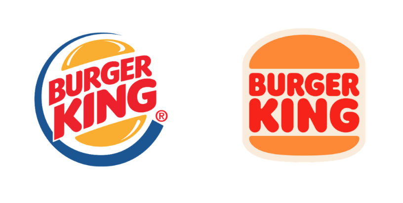
The new Burger King logo is considered to be one of the most effective and impressive redesigning in 2021, so far. After two decades the brand dropped the multicolour and vibrant look adapting to a retro look with a little essence of modernisation. It’s considered to be one of the best combinations of minimalism & nostalgic logo.

This particular brand didn’t have to rock the boat to redesign its new logo. Discord played its logo redesigning part by changing the font from punchy all-caps to bubbly lower case text. The font case and weight of the font worked for the brand.
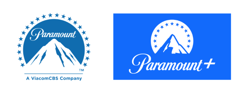
Another perfect example of adapting a retro logo in modern times. A mixture of modern and vintage logos has been adapted by a lot of big brands. The newly designed logo of Paramount is both streamlined and more flattered even though it carries a nostalgic and adventurous taste in it.
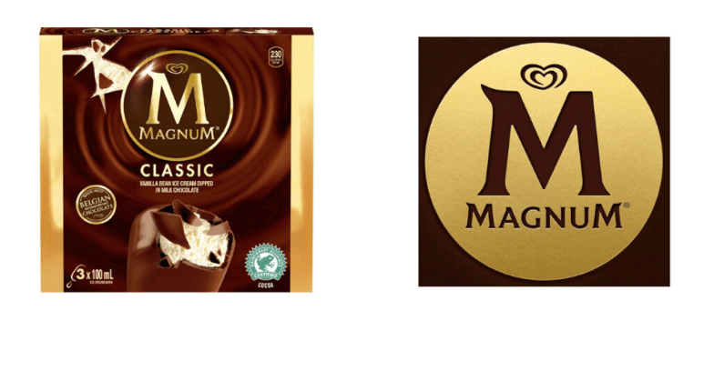
I am pretty sure, you must have all enjoyed the delicious ice cream of this popular brand. However, the brand decided to revamp its logo last year. The new logo is an inverted version of its previous logo. Compared with the old one, the newly designed logo comes out as a gold stamp making it more impactful and attractive. This logo redesign focused on their new brand positioning ‘liberated force of pleasure’.
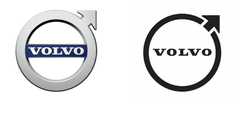
The Swedish car giant updated its brand logo by replacing the old metallic logo with a beautifully designed digital retro logo. Just like some of our previous brands mentioned above Volvo adapted the idea of a modern & vintage logo.
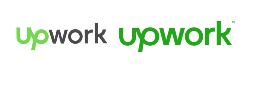
A popular brand that provides freelancers with a space to explore and built a healthy career, worked on redesigning its logo last year. However, the brand didn’t make waves to create an impact. The logo was turned the entire logo from a dual colour logo to adapting a single colour (the green look). This worked for the brand by giving it a completely optimistic fresh look.
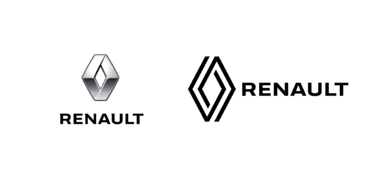
Another well-known automobile brand redesigned its logo from a simple geometric design to a motion one which was lacking in the previous one. The double lines embedded with parallel movements depict the car wheels on the road. This redesigning clearly shows how a logo can be smartly redesigned creating a deep meaning with small changes done with greater motive.
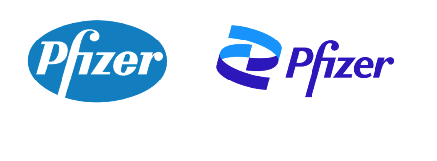
The world-famous pharmacy grabbed the attention when the brand decided to change its logo. The 2021 logo has a positive look that was missing in the previous one whereas the similar font keeps the legacy of the brand intact.
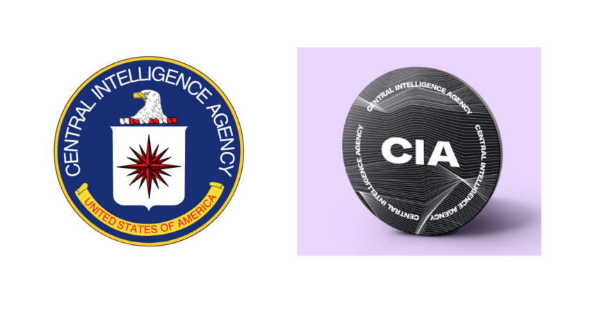
Not only brands from luxury, lifestyle and health were upfront in redesigning their logo, but the famous U.S.A government security department the CIA (Central Intelligence Agency) finally upgraded their logo. A logo that wasn’t much appreciated ever has been replaced by a classic subtle logo with text doing the rest of the job. Making it ten times better than the last logo.
Not only brands from luxury, lifestyle and health were upfront in redesigning their logo, but the famous U.S.A government security department the CIA (Central Intelligence Agency) finally upgraded their logo. A logo that wasn’t much appreciated ever has been replaced by a classic subtle logo with text doing the rest of the job. Making it ten times better than the last logo.
Plot No. 344, CTS No. 2537, Sahakar Nagar, Pune, Maharashtra 411009
For general work-related enquiries-
M.: +91 9822326813
For career related enquiries
M.: +91 9561976702
E.: hr@optimist.co.in